A more assured digital home for Modern Luxuria.
An Edmonton publication chose to keep refining its WordPress experience until the structure, pacing, and presentation felt closer to the quality of the magazine itself. The redesigned website launched on September 1, 2026.
Article by Nicholas Duff
Visit Modern Luxuria- Client
- Modern Luxuria
- Location
- Edmonton, Alberta
- Services
- WordPress redesign, Website maintenance
- Platform
- WordPress
- Project
- August–September 2026
- Status
- Launched September 1, 2026
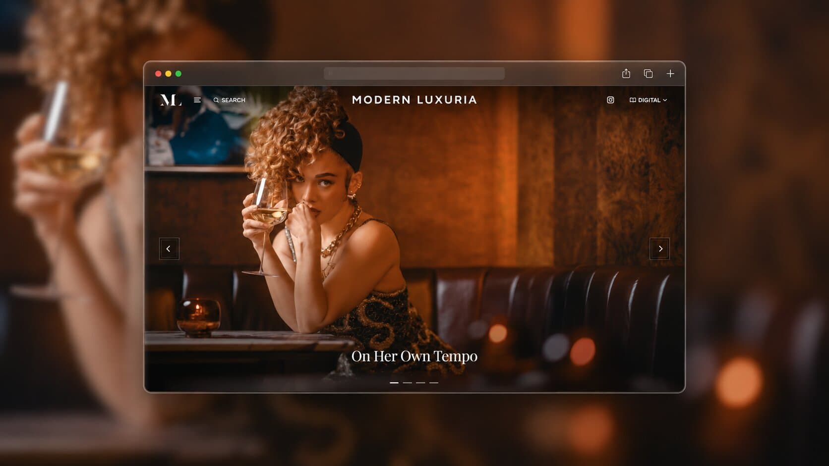
A publication built around Edmonton
Modern Luxuria documents the character of Edmonton across a broad editorial range. Its website is both a front door to that coverage and an archive where stories from different editions remain discoverable after print distribution.
That range creates a particular design responsibility. Readers should be able to move from a timely feature to an older edition without losing the publication's point of view. Photography needs room. Categories need clarity. And none of it should compete with the editorial mood.
The website was carrying too much friction
The live WordPress site had recurring reliability concerns recorded in the project brief: slow responses, images that did not consistently appear, and pages that could time out before their content loaded. Its structure also made the magazine's breadth harder to read at a glance. Strong editorial work was competing with the experience around it.
For a visual publication, those concerns are connected. A slow or incomplete page can break the sequence before a reader reaches a story, while an uneven hierarchy can make the archive feel less coherent than it is. The archive also needed a structure that could stay clear as new issues and categories accumulated. The work needed to address the WordPress foundation and the editorial frame together. Neither could be treated as surface polish.
Modern Luxuria had already invested in a redesign. That earlier direction improved parts of the presentation but did not go live, and Elsa Amorim felt it still stopped short of the luxury editorial standard she wanted.
Elsa chose to keep refining
Elsa brought the earlier redesign to HD Web as a starting point. She shared references, explained where the experience still felt unresolved, and gave broad latitude to reconsider the system. The assignment was to identify what could be retained, what needed a clearer role, and where a more decisive editorial approach would help the publication feel like itself online.
Three states, one editorial standard
The comparison shows how the publication kept working toward an experience that made its breadth easier to understand and its photography more central.
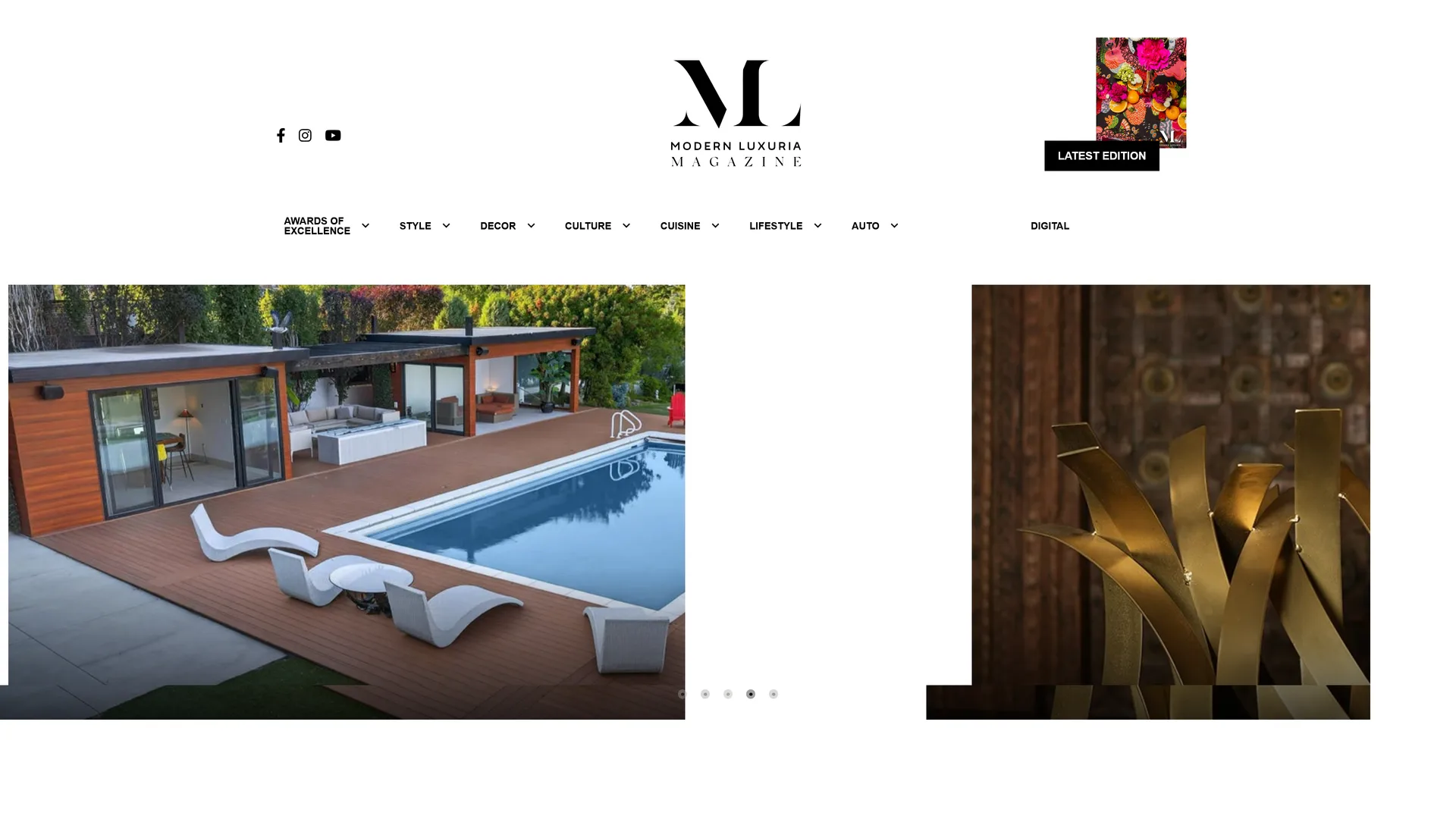
A dense page with many independent content blocks and a conventional publication header.
The previous homepage, captured before the September 2026 launch.
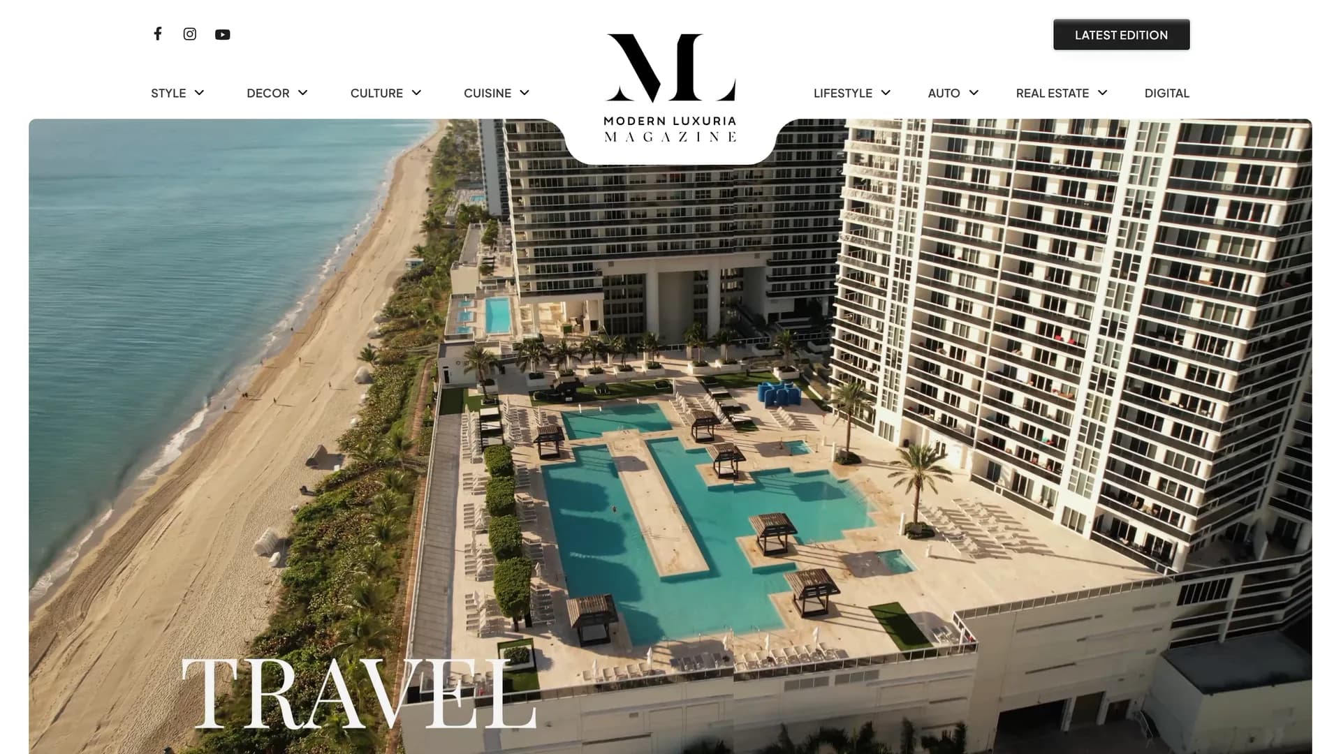
A more image-led direction that introduced a larger feature area and clearer category groupings.
The earlier redesign supplied by the client as a useful starting point.
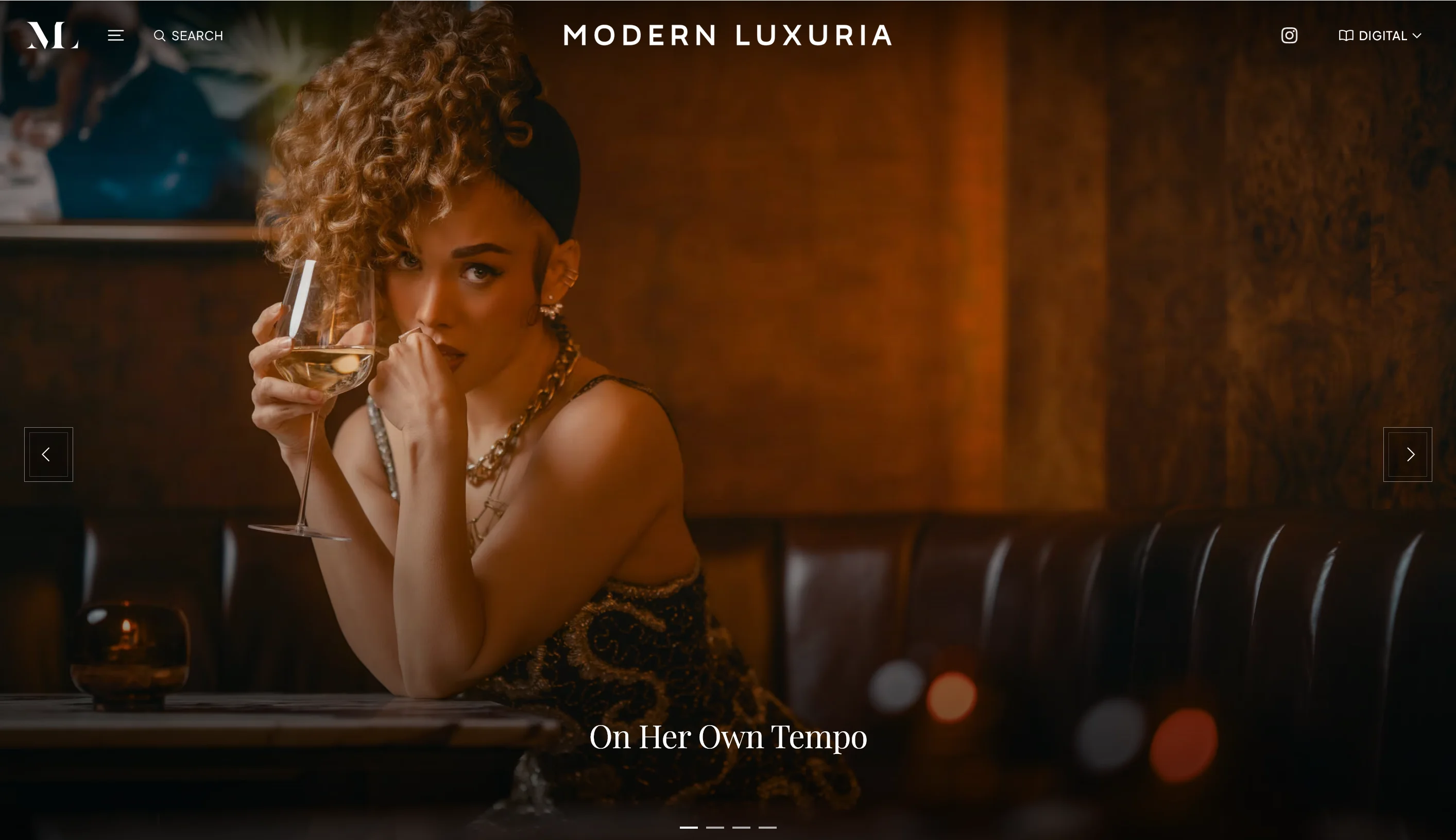
A restrained editorial frame that lets one feature set the atmosphere before the page opens into the archive.
The HD Web redesign, captured during development before launch.
Five principles for the new experience
- 01
Let photography lead
Use scale and sequence to establish atmosphere before asking readers to scan.
- 02
Create editorial rhythm
Alternate full-bleed features with compact story groups so long pages remain legible.
- 03
Keep utility quiet
Make search, navigation, editions, and events easy to find without letting controls dominate.
- 04
Build one system
Carry the same hierarchy, spacing, and interaction rules from the homepage into every supporting view.
- 05
Respect publishing reality
Shape the design around a maintained WordPress publication with real content and real constraints.
Decisions made across the experience
Each chapter connects a visible interface decision to the reading experience across Modern Luxuria's editorial work.
A quieter frame for a broad archive
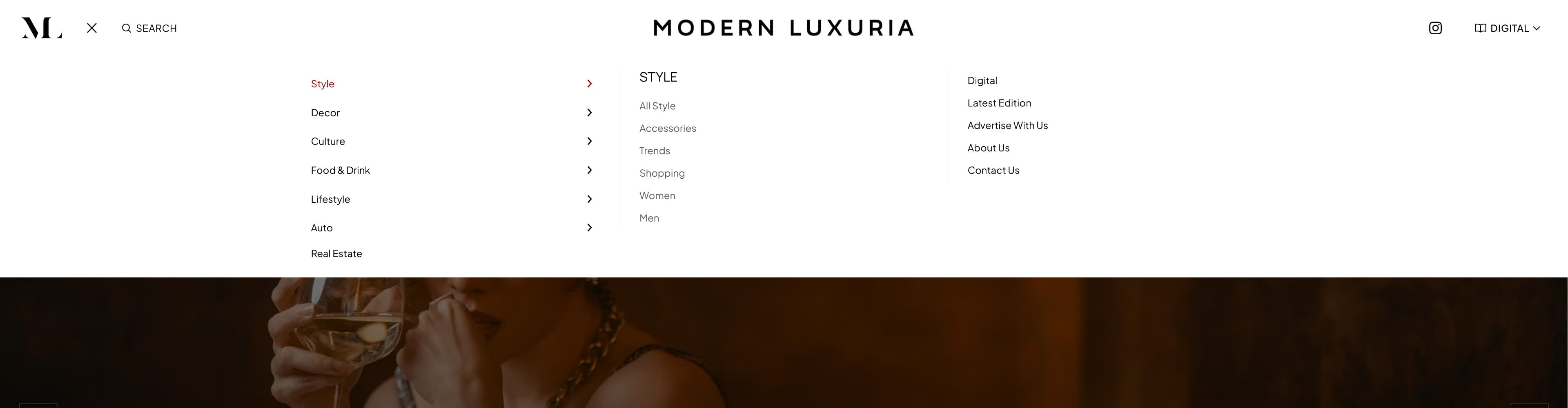
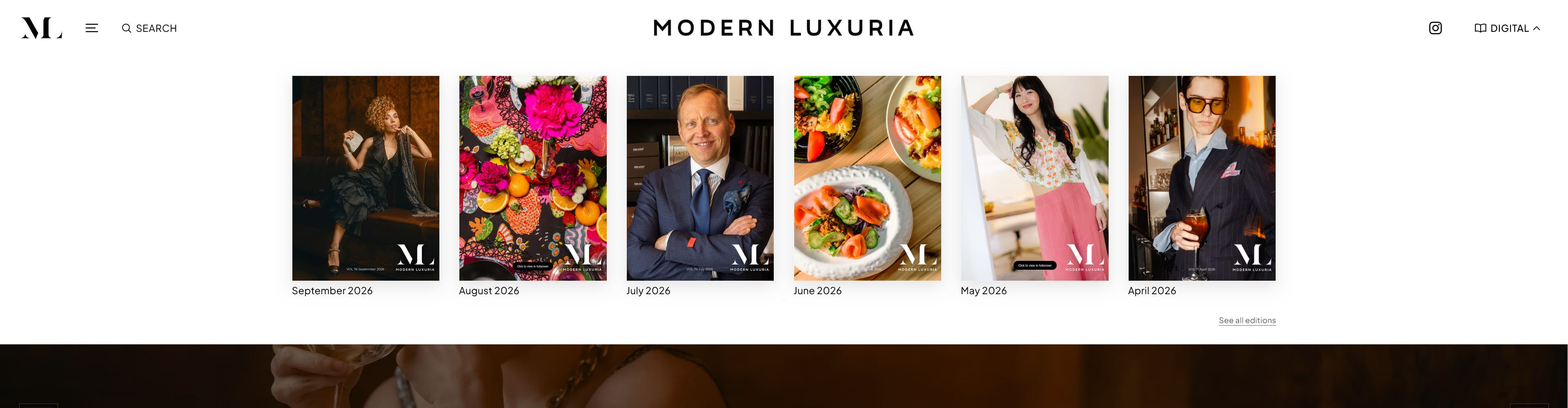
Modern Luxuria spans style, décor, culture, cuisine, lifestyle, automotive, real estate, events, and digital editions. Keeping every destination visible at once would have made the header compete with the stories. The redesigned header reduces that surface to the publication mark and a few deliberate entry points.
The menu then expands into a full editorial index. Categories have room to breathe and search is visible. Recent editions get their own visual treatment. Readers can understand the archive without the homepage carrying the entire information structure above every story.
One strong opening, then a measured sequence
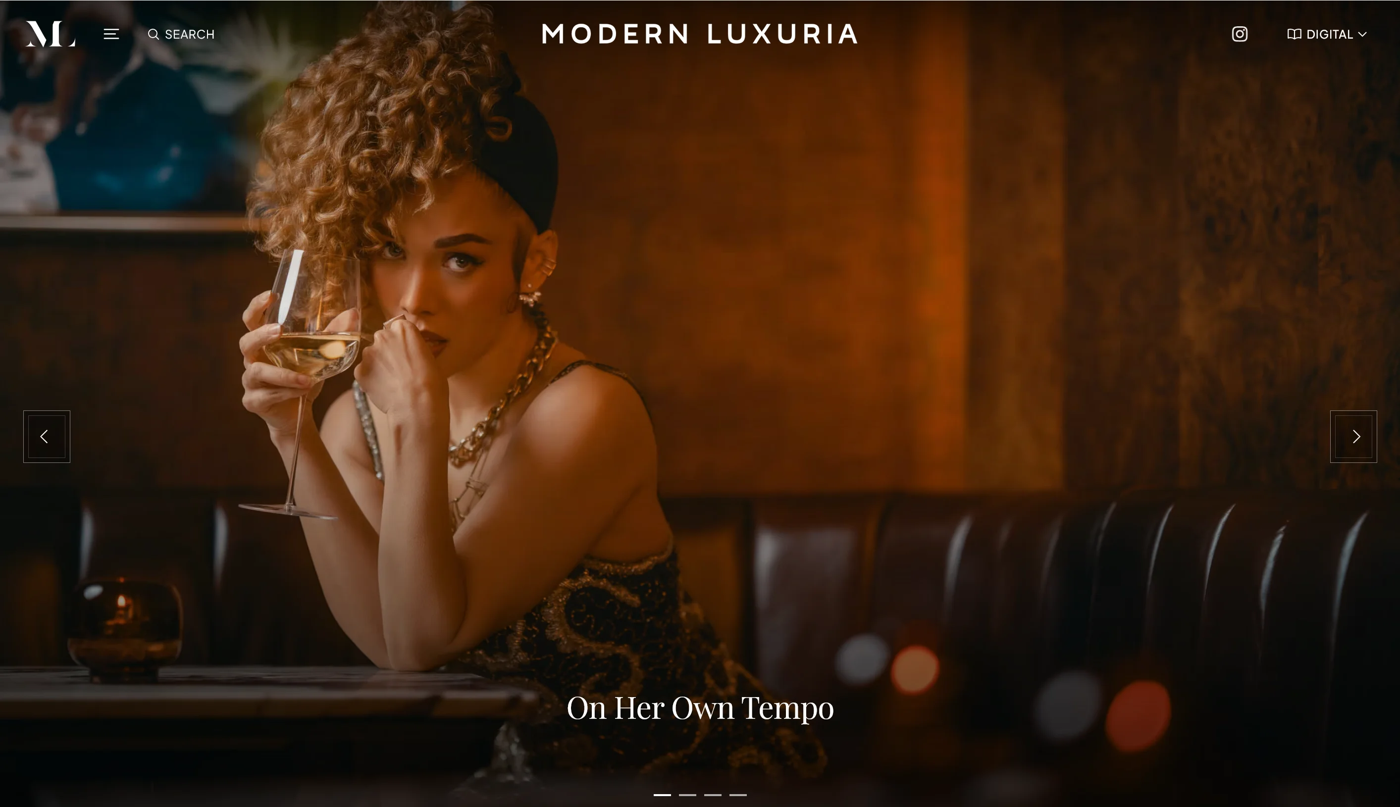
The homepage opens with a single photographic feature. A small title and restrained controls preserve the image while still making the story available. From there, the page changes tempo: current edition categories establish breadth, larger features create pauses, and the archive becomes easy to scan through compact cards.
This pacing gives prominent stories more presence without treating every article as a hero. It also creates a repeatable pattern for new editorial material, so the publication can evolve without rebuilding the page for every issue.
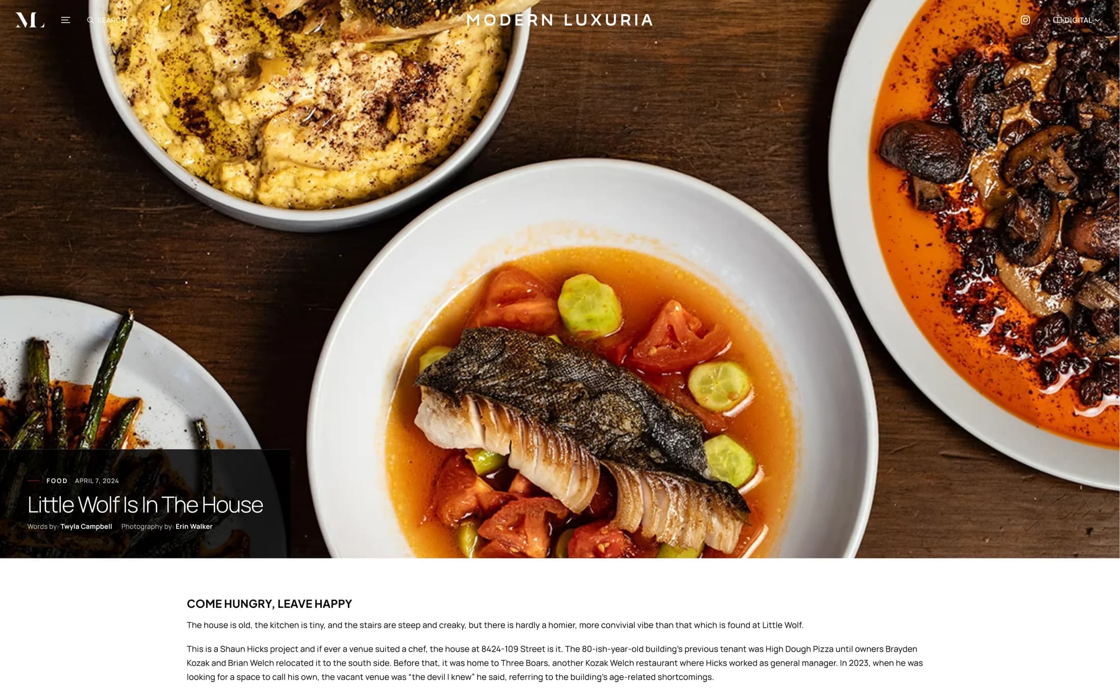
Discovery and reading now share a language
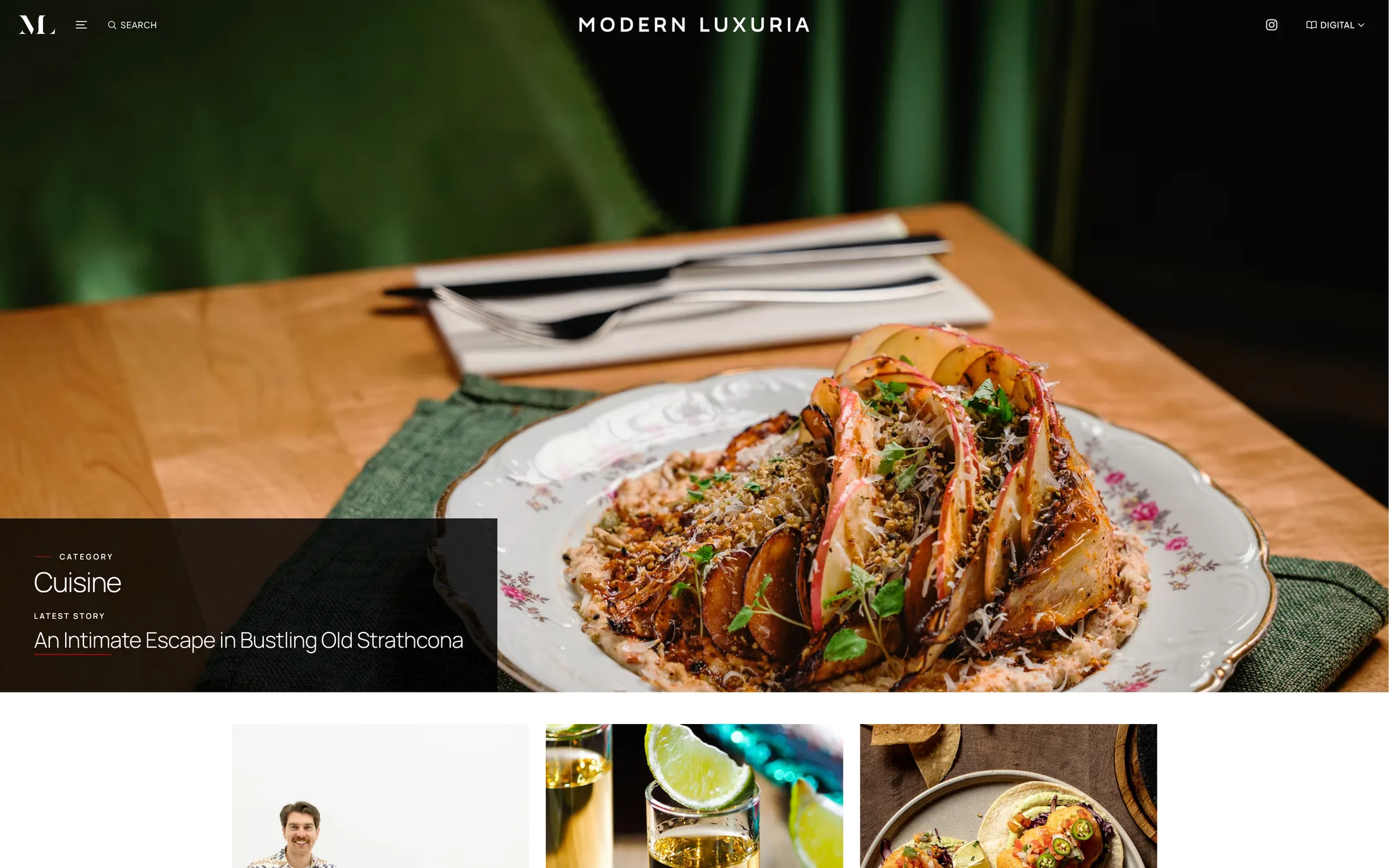
Category pages and individual stories were treated as parts of the same reading sequence. The index uses consistent labels, image proportions, and whitespace to help readers compare stories. The article template opens the selected story with a clearer hierarchy and generous media treatment, then settles into a calmer reading column.
The benefit is continuity. A reader moving from a category page into an article does not feel as though they have entered a separate product, and editors have a stable framework for both visual features and text-led reporting.
Utility designed as part of the publication
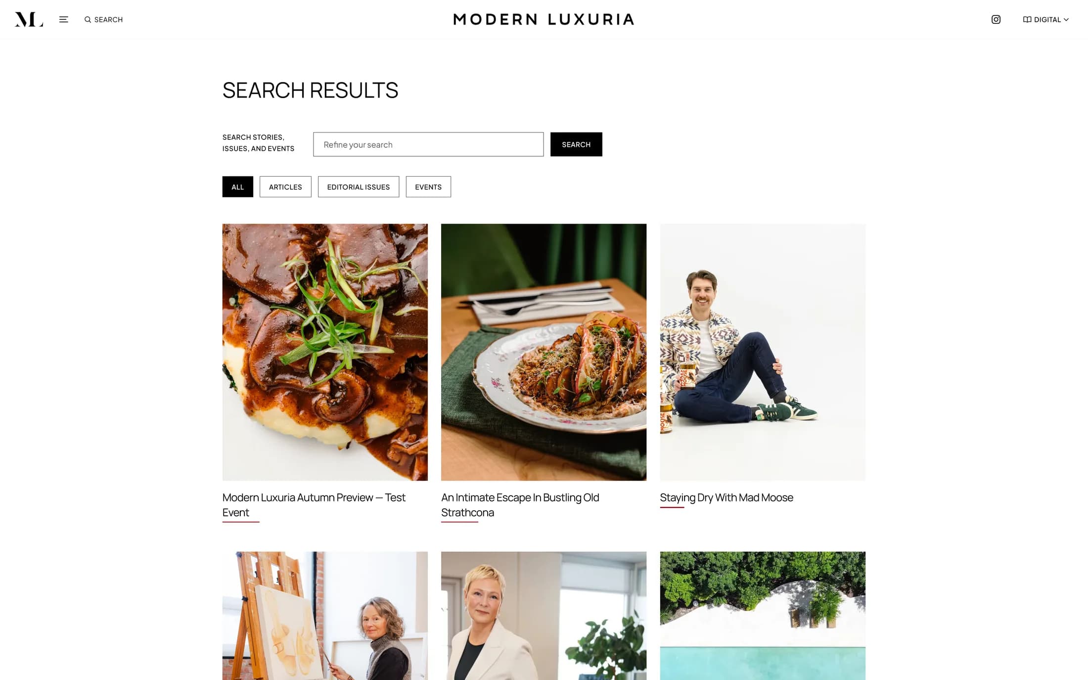
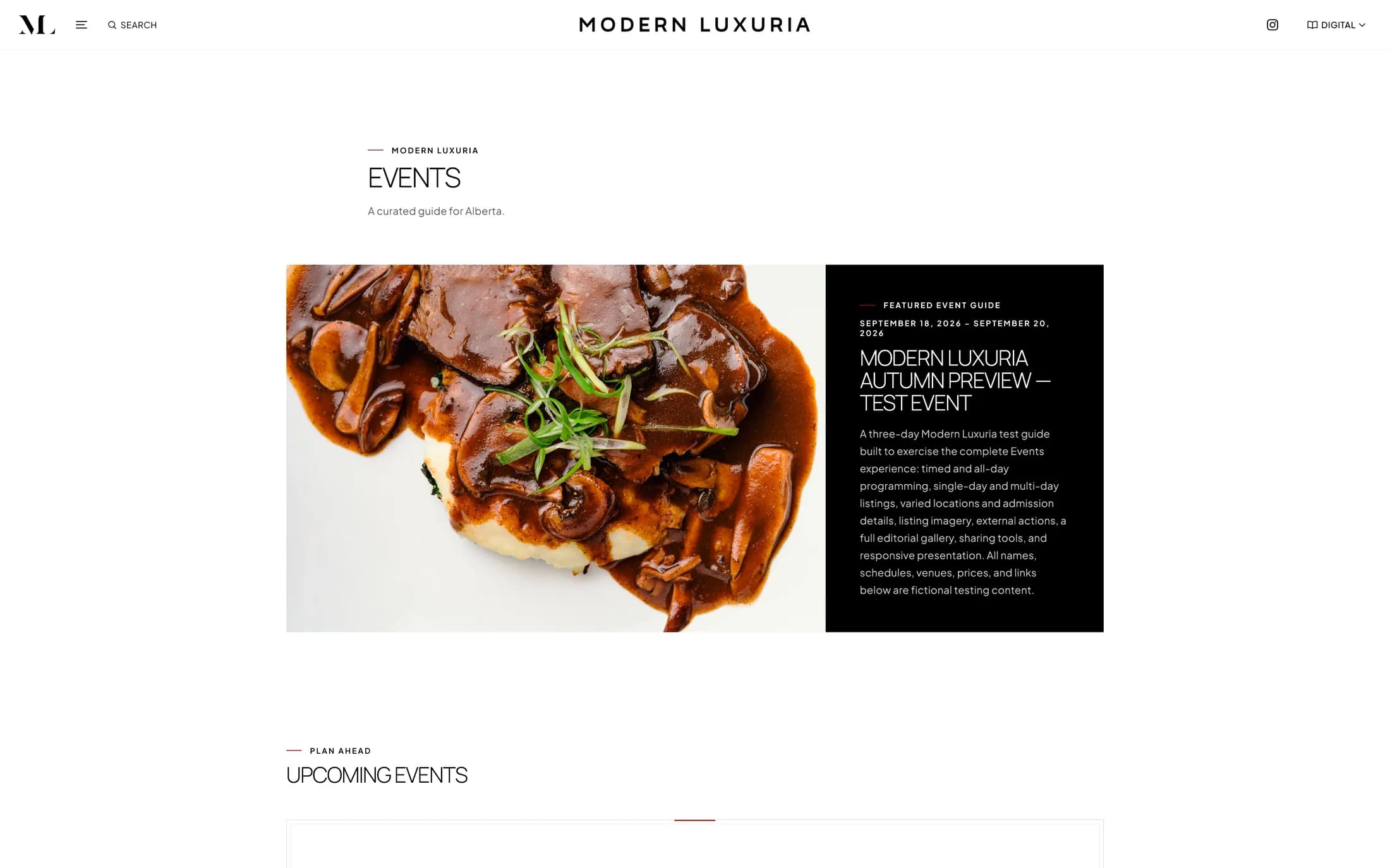
Search and events are useful only when they feel connected to the rest of the site. Search results introduce filters without turning the page into an application dashboard. Event listings use the same photographic hierarchy as editorial stories while making dates and event details easier to scan.
Both capabilities are new design work within this direction. They extend discovery beyond browsing the latest homepage and give older stories and local happenings clearer routes back into view.
The identity continues beyond the feature story
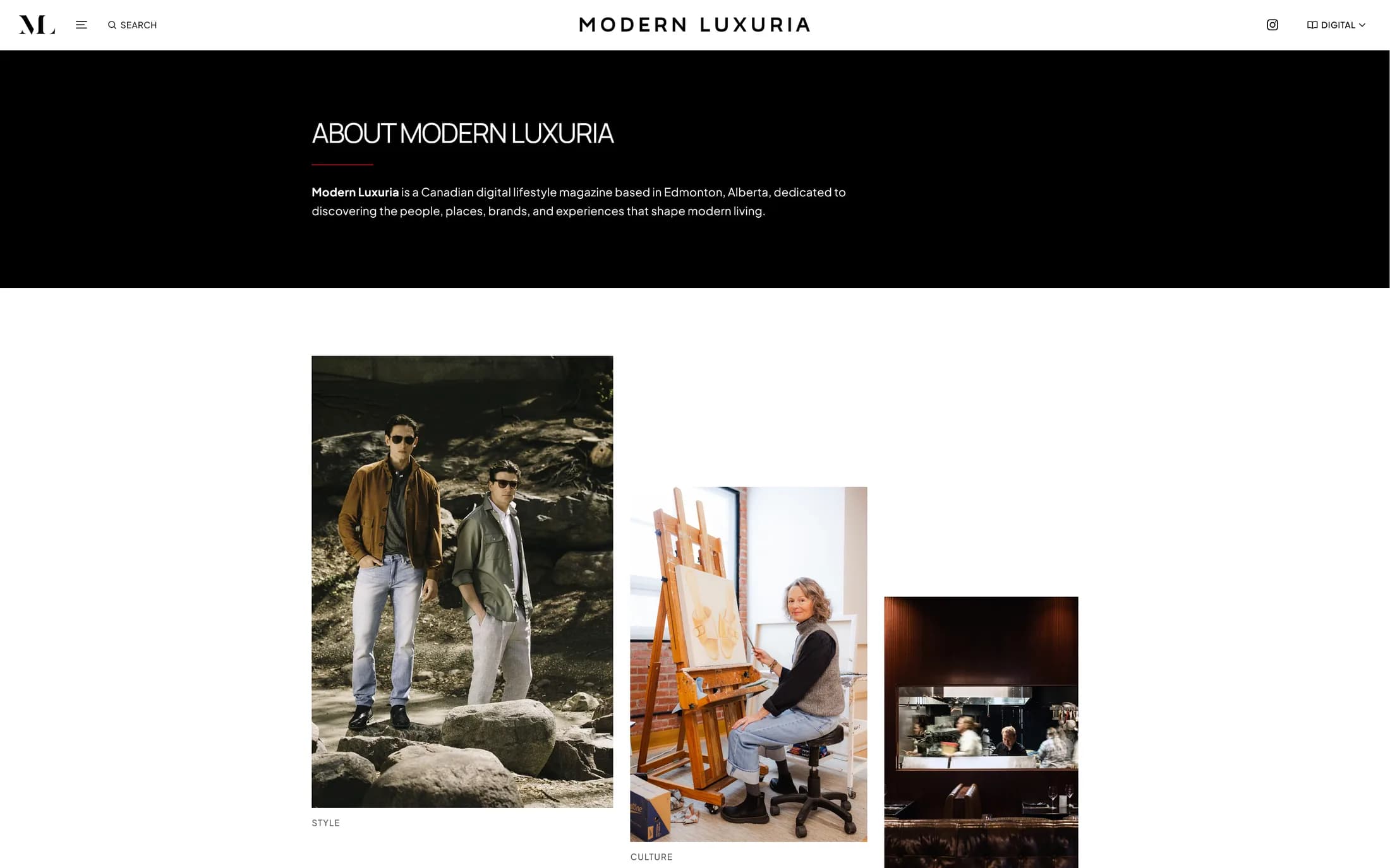
A publication is judged in its quieter moments too. About, contact, subscription, and footer areas were brought into the same system so the visual standard does not disappear when a reader leaves the editorial feed. The About direction pairs a direct introduction with publication imagery and clearer supporting information.
These pages do not need the drama of the homepage. Their role is to make the organization understandable, provide dependable next steps, and maintain the same restraint throughout.
A publishing system shaped together
A system designed to hold together
The refined direction depends on details that repeat: disciplined image proportions, small typographic shifts between labels and headlines, thin rules, and consistent spacing from one template to the next. Those decisions give varied photography a stable frame and let each story's imagery set its own mood.
Because the work lives in WordPress, the system also has to accommodate real publishing. Templates were shaped for changing headlines, categories, editions, and image sets, not a single idealized screenshot.
Refinement as a shared decision
Elsa's earlier investment made the project more informed. It provided a concrete direction to respond to and helped clarify what still felt unresolved. HD Web used that material, the publication's references, and the existing WordPress structure to focus each round on hierarchy, consistency, and editorial use.
The result is continued stewardship of an established publication. Modern Luxuria set the standard it wanted to reach; the design work translated that standard into a coherent web system.
What is now in place
The website launched on September 1, 2026. These are the delivered capabilities and design decisions; business outcomes have not yet been measured.
- 01A redesigned homepage with a repeatable editorial hierarchy
- 02A consolidated mega-navigation and digital-edition path
- 03Reworked category indexes and article templates
- 04New search results with filtering
- 05New event listing and event-detail experiences
- 06Redesigned supporting pages and footer areas
- 07Ongoing WordPress maintenance within the approved scope
Client perspective
“Everyone is in love with the new site, and we’ve been receiving so many wonderful compliments. You should both be very proud of the work you’ve done.”
What the redesign makes possible
With the redesigned website live, Modern Luxuria has a more consistent WordPress system for presenting its editorial work. Ongoing maintenance supports the publication as new stories, editions, and events are added.
The next questions are practical: whether readers reach more stories, how search and events are used, and how the templates support the editorial team. Those observations belong in a future update once evidence is available.
Start a conversation
If your digital presence no longer reflects the standard of the work behind it, we can compare notes without turning the conversation into a sales pitch.